Choosing Gormley Designs LLC As Your Architect
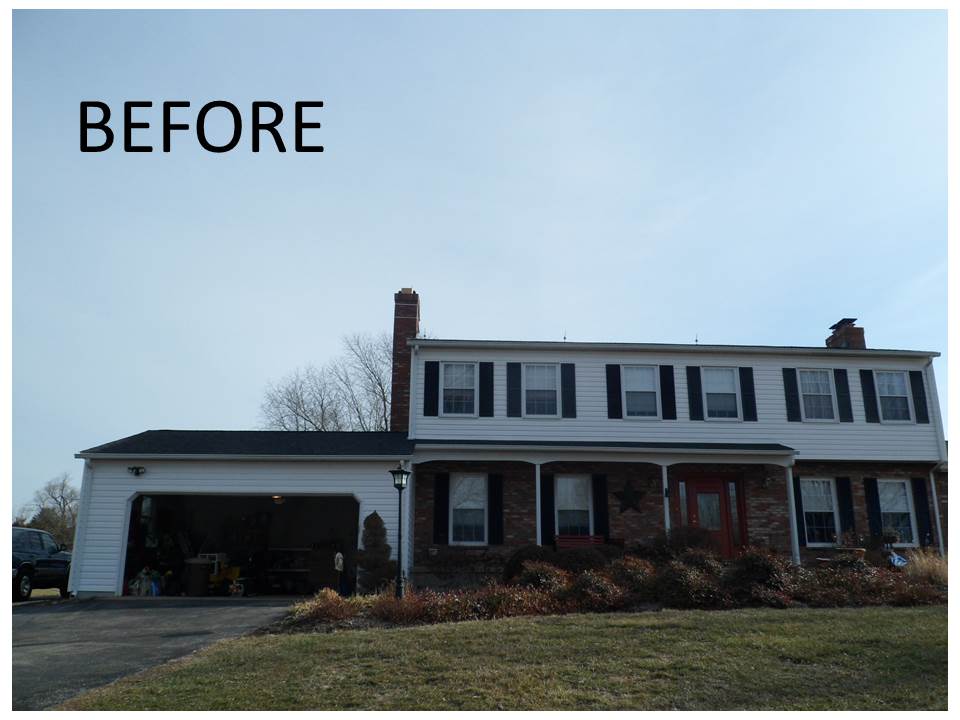
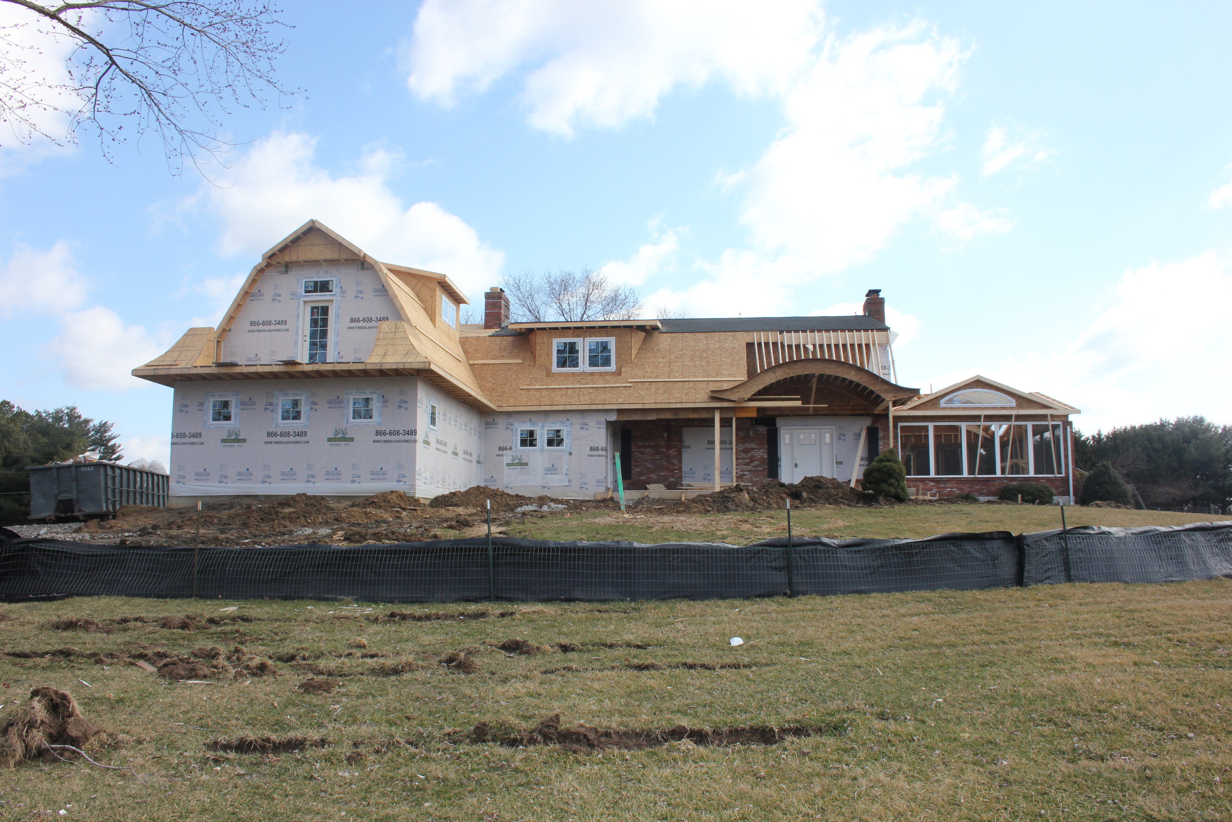
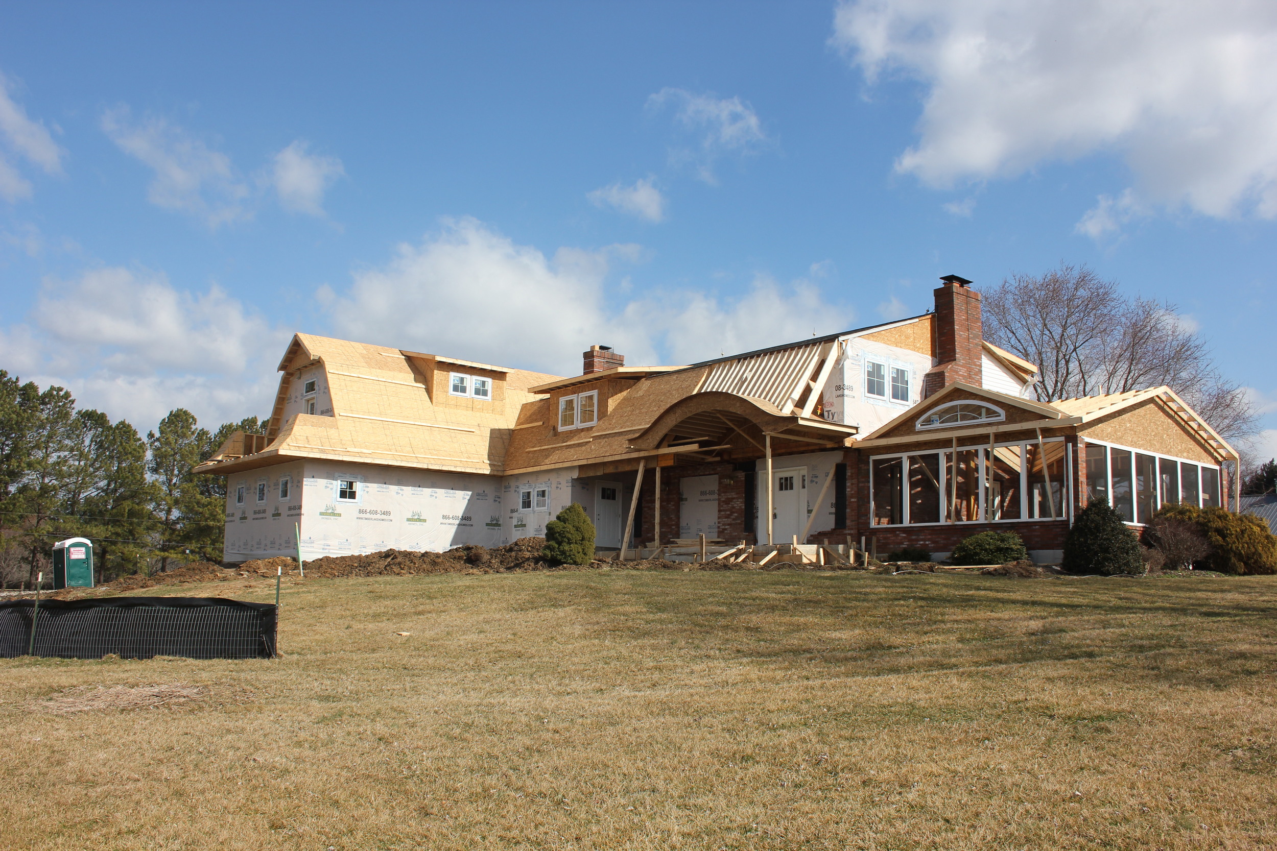
Dormers are a great way to update your home
Gormley Designs Kitchen That Opens Up to the Outdoors
5 Ways to Open Your Kitchen up to the Outdoors
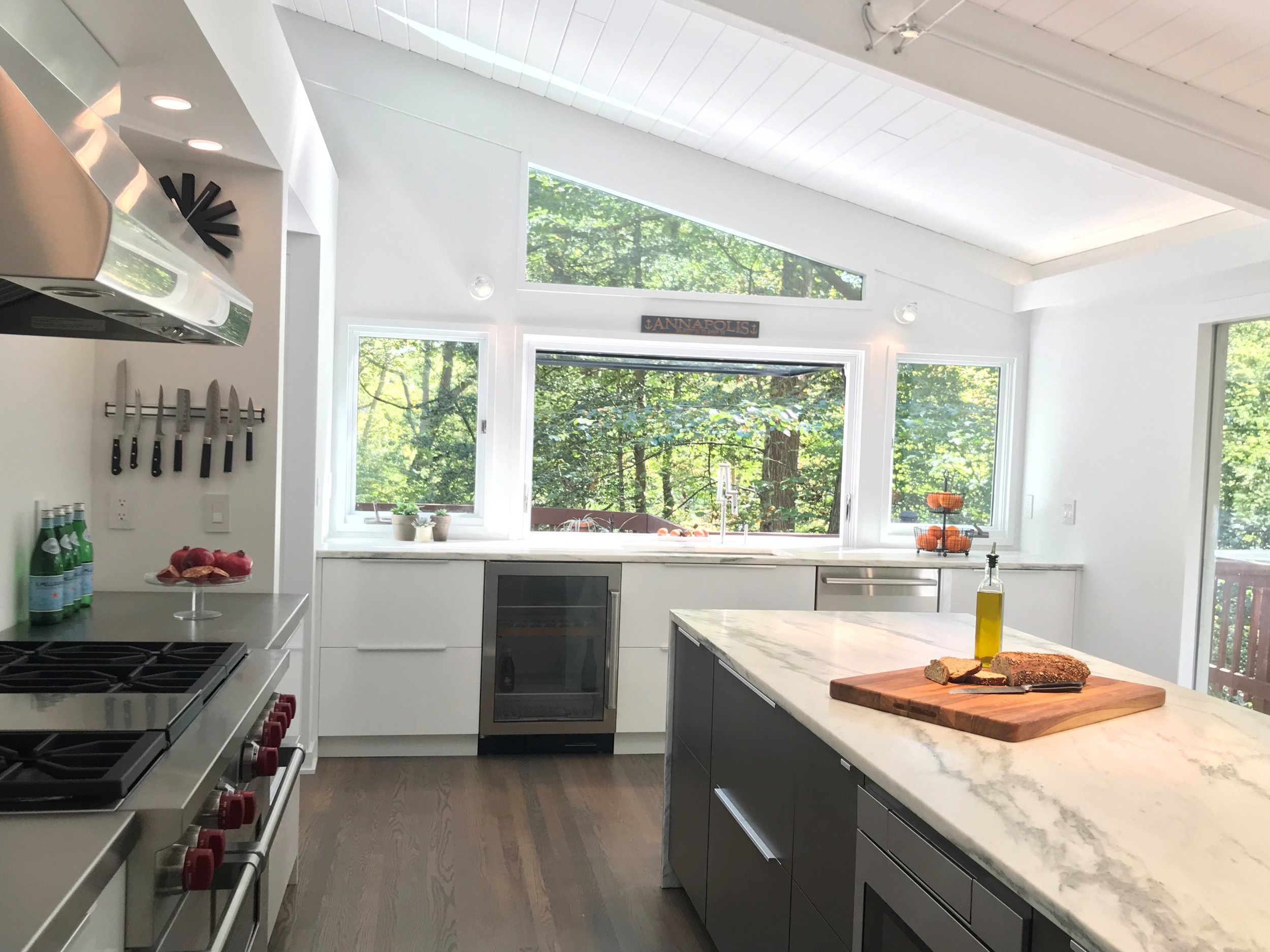
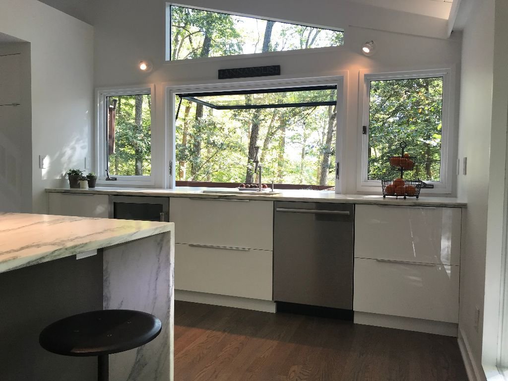
This Gormley Design’s kitchen connects outdoor living with the indoors. You don’t need a separate outdoor kitchen and you can save money by not building an unnecessary second outdoor kitchen. Your indoor kitchen can double as an outdoor kitchen with these 5 moves to open up your kitchen to the outdoors.
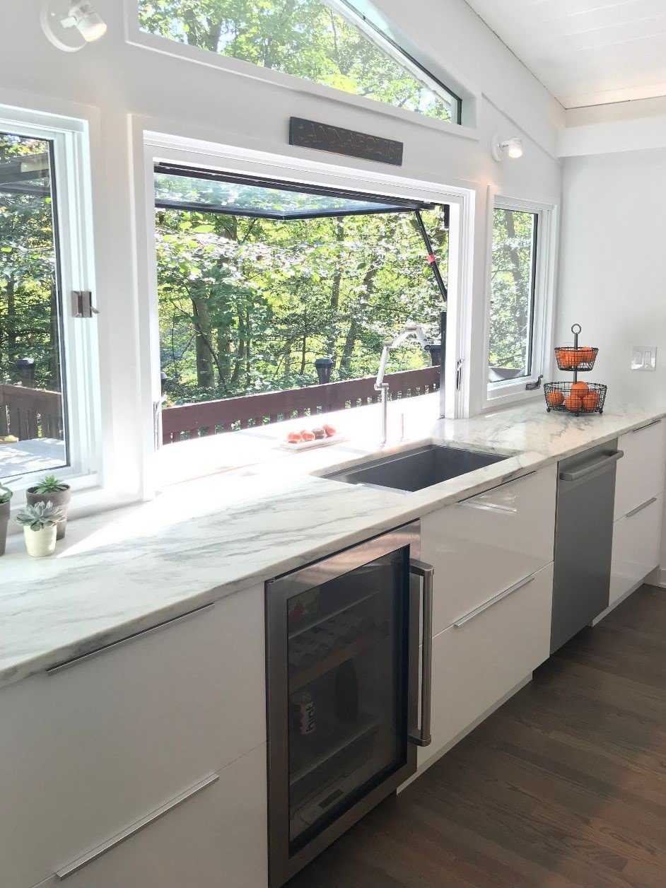
#1 Removing upper cabinets on the exterior wall of your kitchen is a great opportunity to install a large window. The result floods this kitchen with large amounts of bright natural light. The large window also creates a more contemporary feel. Also note that these lower cabinets are all drawer style cabinets adding to the contemporary aesthetic of the kitchen.
#2 Placing the main kitchen sink in front of this window creates an opportunity for those inside to enjoy the outside even when the window isn’t open. Having the sink in front of a window is a timeless strong element of kitchen design.
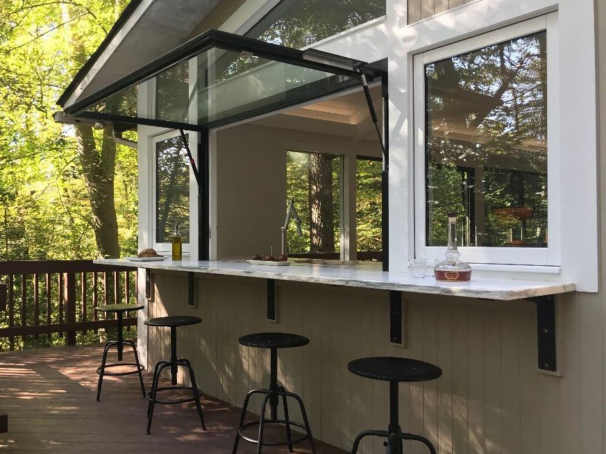
#3 Extending the kitchen counter at the same height to the outside makes for a fun gathering space. Guests are able to interact with those inside the kitchen. This creates an outdoor serving bar great for passing and serving food outside. Keeping the bar at the same height as the interior counter is important for blurring that outside inside line. This makes for a continuous unobstructed plane drawing your eye outdoors. Note: Be sure you create a thermal break in the counter to avoid a moisture problem.
#4 Using an awning style gas strut window creates a large obstacle free opening. The awning window creates a cover to the outdoor serving bar. This results in a sense of space and even provides cover in light rain events. The benefit of the gas struts are they assist those opening the window making it much easier to open. The struts uses stored pressure to assist in the opening. This makes operating the window simple needing only a light push to open. Using a “sill less” window makes for a flush transition from the outside to the inside. Also, the awning style window is up and out of the way, unlike the bifold style windows which take up valuable counter space blocking views. Note that below the counter is a beverage fridge. This is a great addition for entertaining through the open window.
#5 Adding bar style seating on the outside serving bar keeps your guests engaged with those inside in the kitchen. The bar height stools are great seating on decks with railings as this height keeps the eye sight line above the railing even while seated. This results in views not being blocked by the deck railing. This deck is high off the ground making it feel as those you are in the treetops. The large window brings this treetop feel into the interior.
Stacie Gormley, RA (Registered Architect), Gormley Designs LLC
Gormley "eye" on design
www.gormleydesignsllc.com
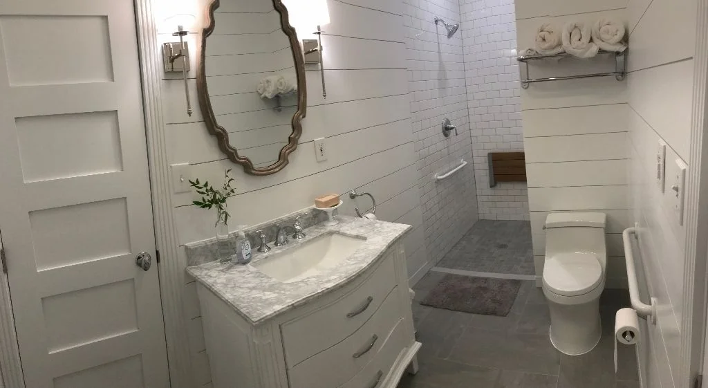
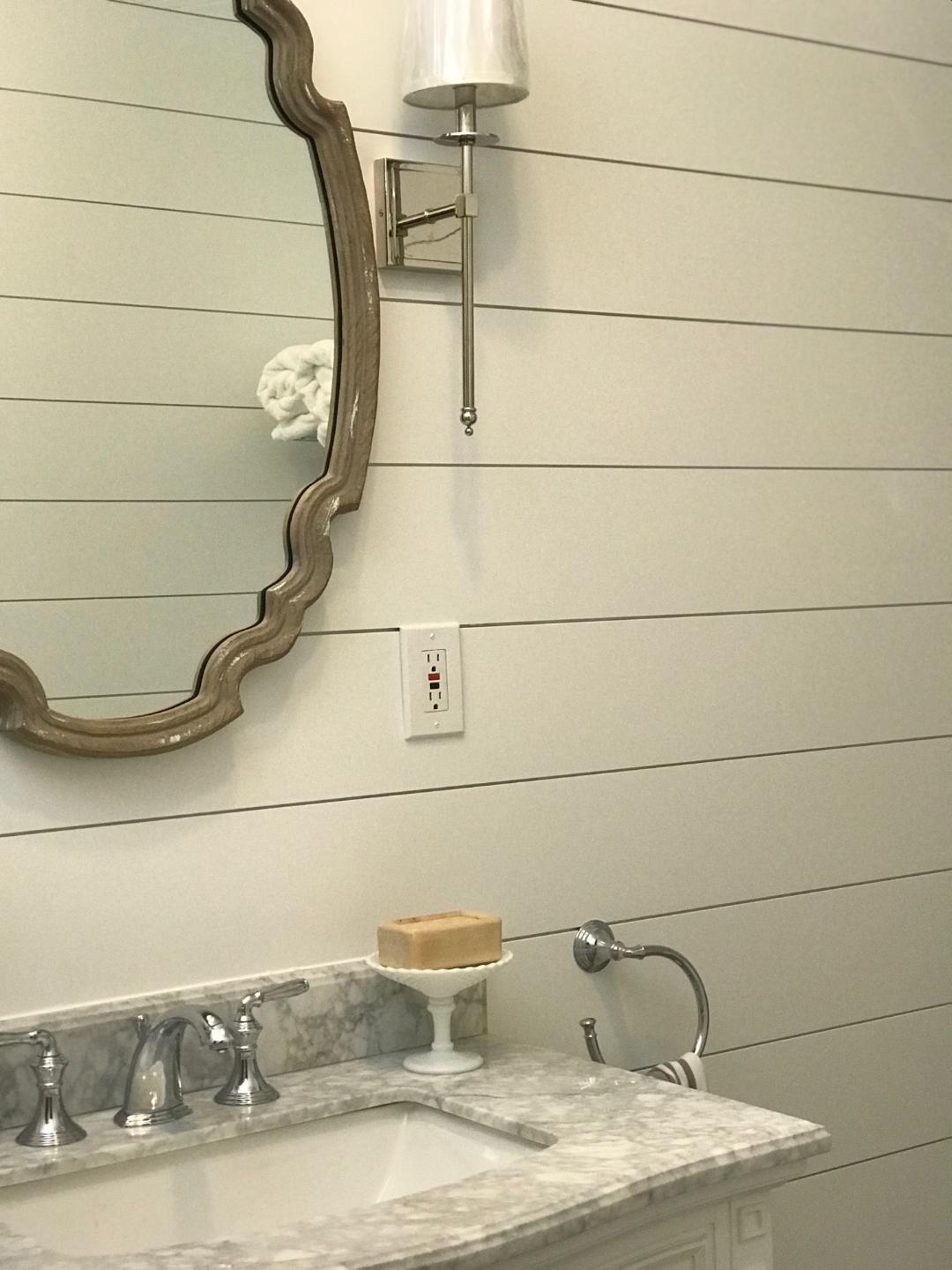
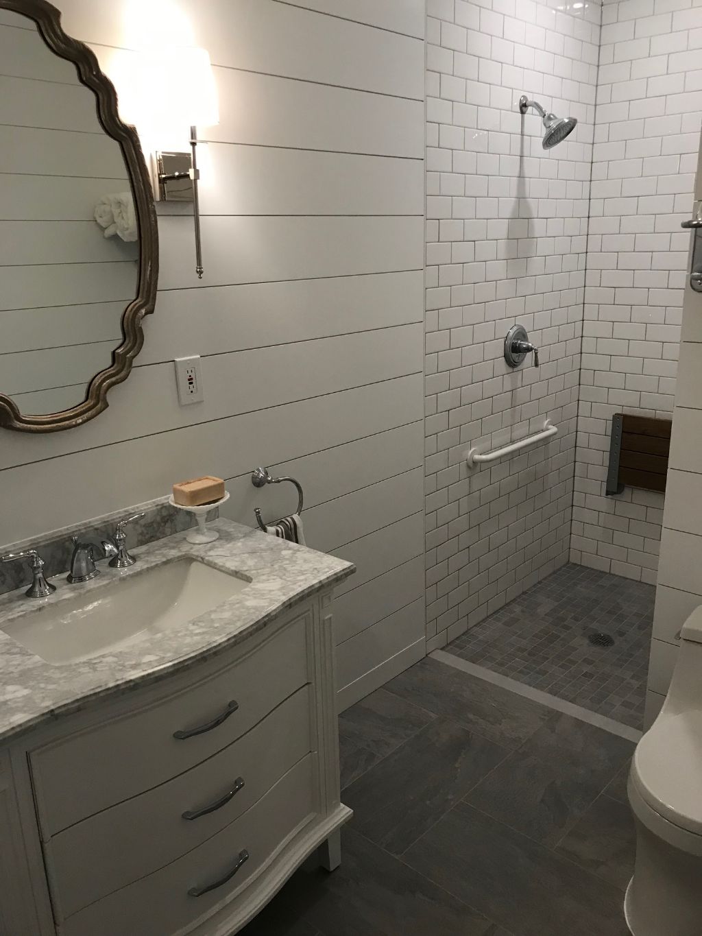
Shiplap adds detail and interest giving this bathroom it’s wow factor.
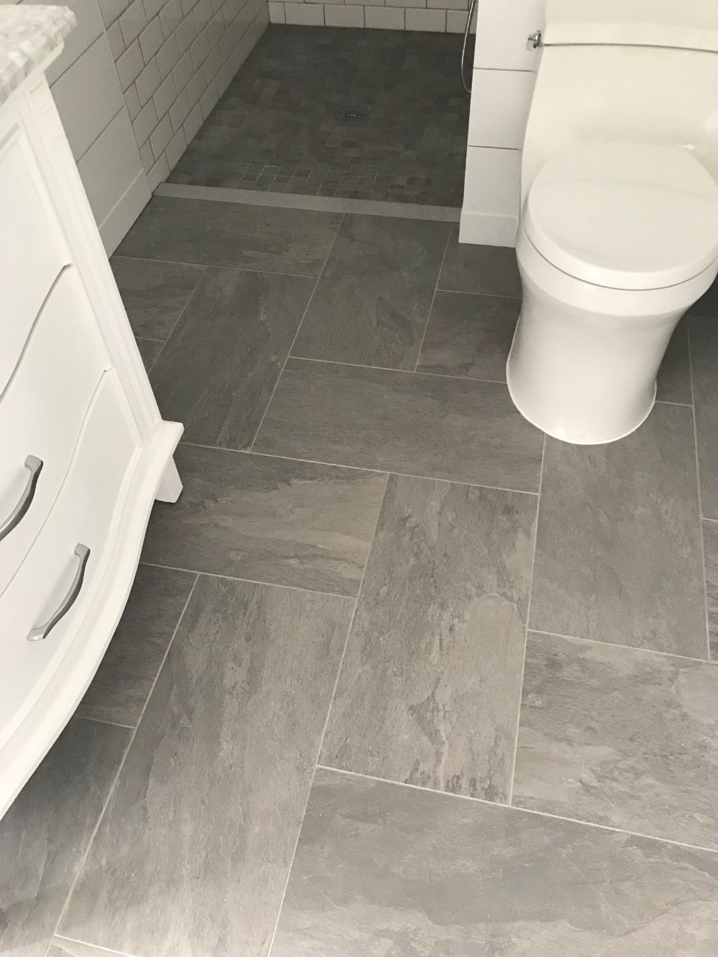
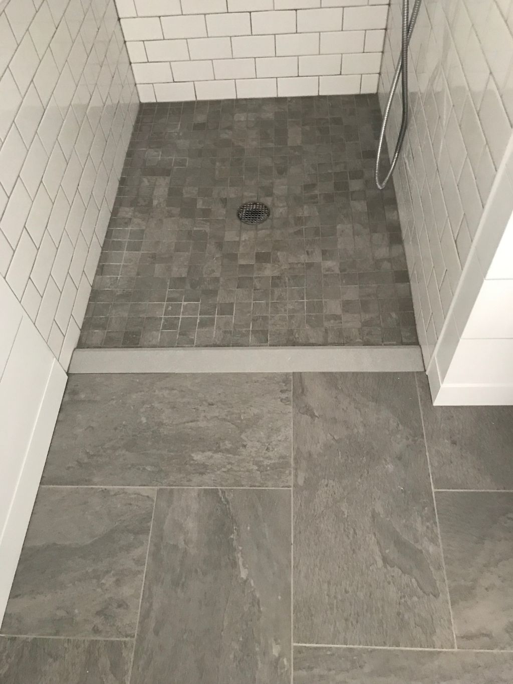
The tile in this bath stays away from trend in color and design resulting in keeping this bath timeless. The walls of the shower are white subway tiles and the floor is a light grey ceramic with coordinating 2 x 2 mosaic shower floor. (Designed by Gormley Designs LLC)
If you like this post please go to our Facebook page and like us at https://www.facebook.com/gormleydesignsllc . If you would like to see more transformations please go to our website at www.gormleydesignsllc.com.
Dramatically Change your Out-of-Date Living room into a "Great Room"...
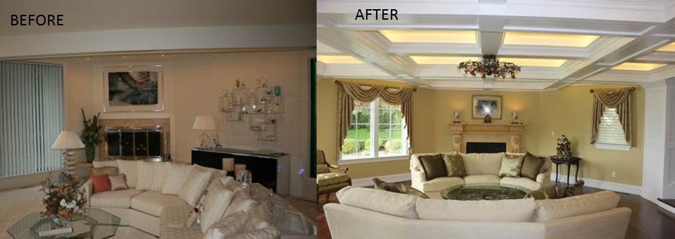
3 Ways Gormley Designs LLC Changed this Living Room into a Great Room...
1)Replacing the simple beamed ceiling with this coffered ceiling and accent lighting creates drama and focus on the fireplace.
2)Replacing the modern windows and window coverings with a more traditional style creates a warmer feel to the space.
3)Hardwood floors replace the existing carpet to finish off the look.
If you like this post please go to our Facebook page and Like us at https://www.facebook.com/gormleydesignsllc. If you are interested in seeing more transformations go to our website at www.gormleydesignsllc.com

